Cards
A card is a flexible and extensible content container. It includes options for headers and footers, a wide variety of content & image.
Below is an example of a basic card with mixed content and a fixed
width. Cards have no fixed width to start, so they’ll naturally fill
the full width of its parent element.
card header

Card title
Card Subtitle
Some quick example text to build on the card title and make up the bulk of the card's content.
Text only card
Card title
Card Subtitle
Some quick example text to build on the card title and make up the bulk of the card's content.
Badge
Apply badge on top left and top right side of card
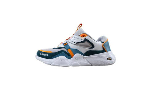
Adidas Originals
Men's running shoes
Rs 1400
Rs 2000
30% off
Overlay
Add an overlay with overlay-container & overlay class
Put overlay inside overlay container and style it with utility classes
Adidas Originals
Men's running shoes
Rs 1400
Rs 2000
30% off
Horizontal card
Adidas Originals
Men's running shoes
Rs 1400
Rs 2000
30% off